
I’ve often used fine art as a starting point for my work. Which maybe sound a little high and mighty for a commercial interiors stylist but it’s the resource that I go back to over and over again. And my gosh, what a resource.
In the main, a piece of art can trigger a thought about an unexpected colour combination, perhaps a particular texture or even the artist’s very particular way of seeing things. I’ll often put an art reference on my mood boards as a way to build and layer ideas - it acts as a kind of key that holds everything together.
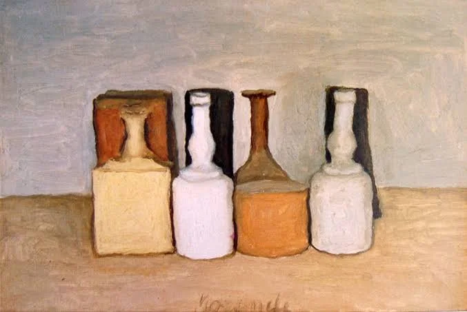
Morandi - an artist I return to time and time again.
It’s actually also something I do in my own home. A print or a small painting I’ve acquired can be a trigger for an entire room’s scheme.
Alongside colour, it’s always a reference for me when I’m actually on set. I often work in triangles (ensuring there is, for example, a colour pop forming this shape) and use the golden section rule. Nothing is ever symmetrical but it is always balanced. And an eye should be encouraged to move around an image, to explore every detail - just as the still life masters encouraged in their works.
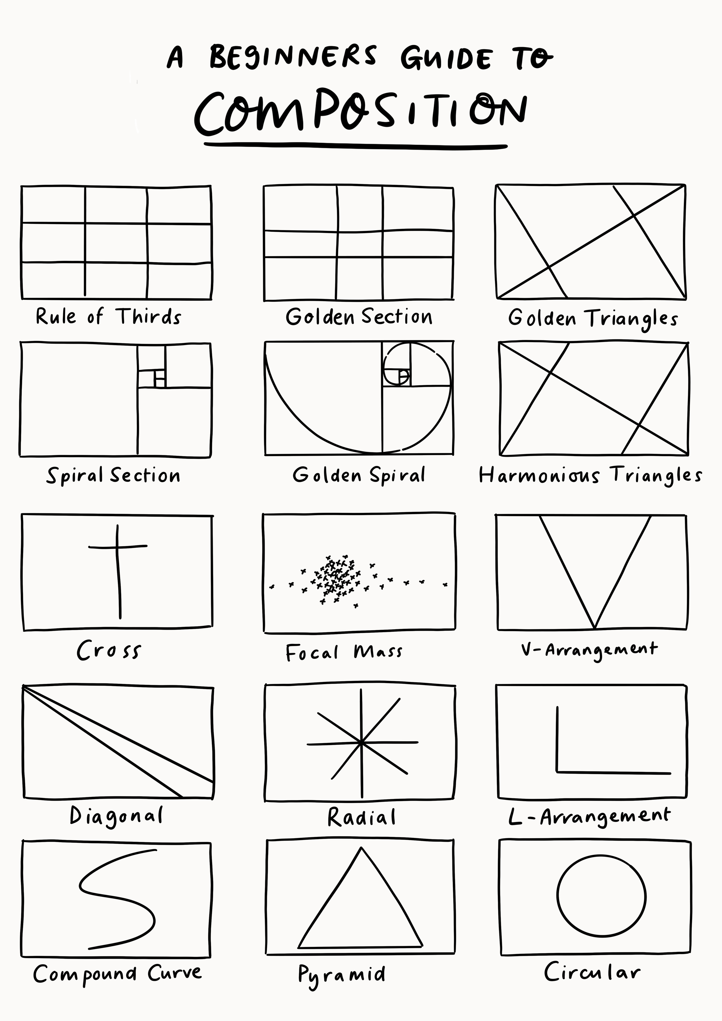
A lovely simple guide to composition. Stylists use these all the time without even realising it’s a ‘thing’.
Art has inspired a whole test piece a while back (shot with my dearest Laura Hutchinson). Katy Hessel’s book ‘The Story of Art without Men’ set me off on an indignant journey of discovery as I learned about utterly forgotten women artists through the ages. In particular, the work of Giovanna Garzoni.
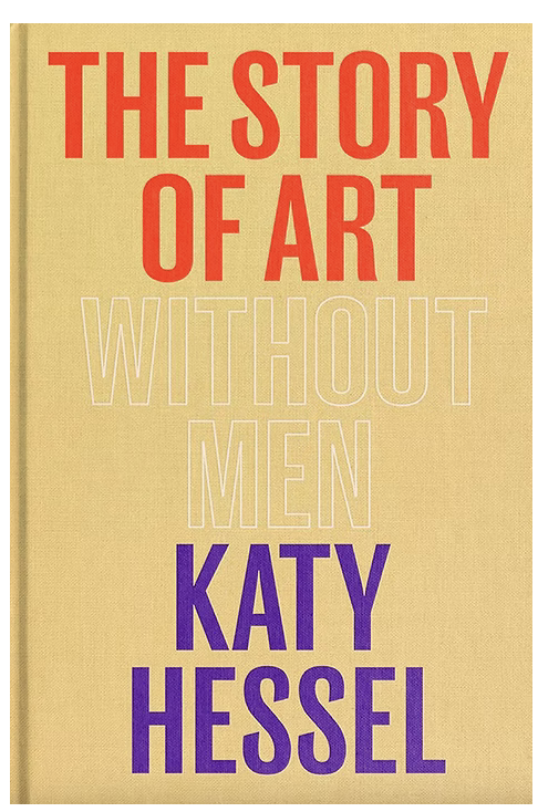
The Story of Art Without Men by
Katy Hessel
Giovanna’s work is saturated with colour that feels strangely modern, has abundance, generosity, weird quirks and such skill. I imagined what it would be like to be Giovanna’s studio assistant. Pictured market trips for the ripest cherries, thought about the found cups lying about the studio that might act as temporary vases and wondered how one might catch the various insects that are always there in her pieces as a motif.
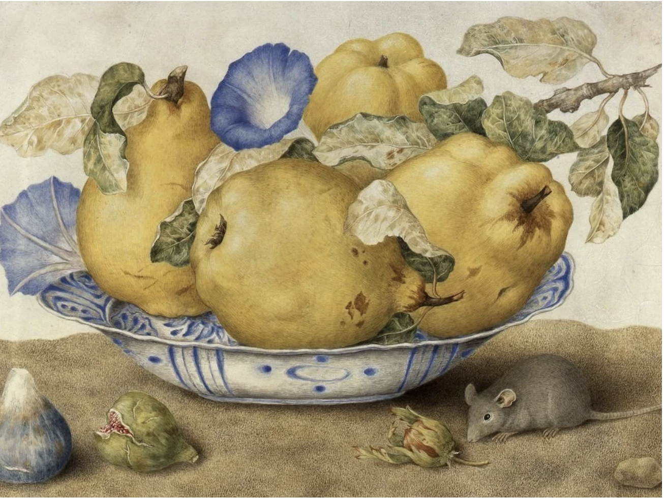
Giovanna Garzoni’s ‘Still Life
with mouse’
The result was not a contemporary take on her work, but instead a modern eye on the building blocks of her art. Layered up much like paint on a palette, these peculiar items suddenly became new compositions of their own. You can see the finished images here.
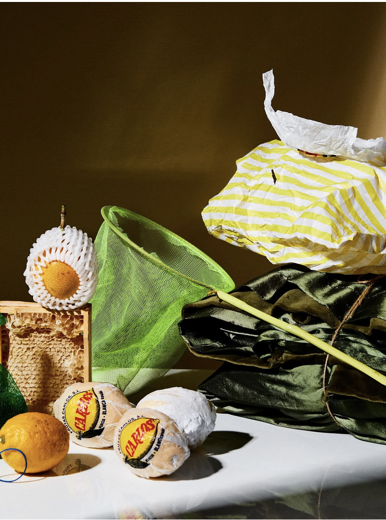
Still Life by LauraLaura Studio - a project inspired by Giovanna Garzoni
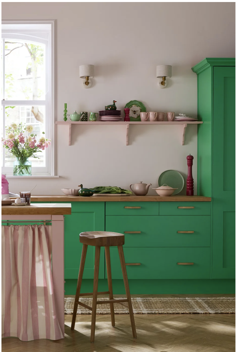
A shot I art directed and styled for Earthborn Paints. The inverted green L shape of the cabinet frames the shot and that colour is scattered across the image so that the eye doesn’t get stuck. There is also a triangle of deep fuschia - from the large pepper pot on the right, up to the small pot on the shelf and then across the left to the jam. All of this is designed to make sure your eyes move around the image.
Good styling, I would argue, is comparable to the process of fine art. The blank canvas, the building of layers and colour, the focus on the all important subject matter and always finding ways to direct a viewer’s eye to it. Even the smallest of shots is still a composition.
Stylists often undersell themselves (and yes, can be underestimated too - we often hear phrases such as ‘you’re just here to fluff cushions aren’t you? - I guess the artist’s version of that is ‘My 3 year old could have done that’) But if a stylist and an artist were to stand side by side and explain all of their creative process and thought behind each shot, it really wouldn’t be that dissimilar.